
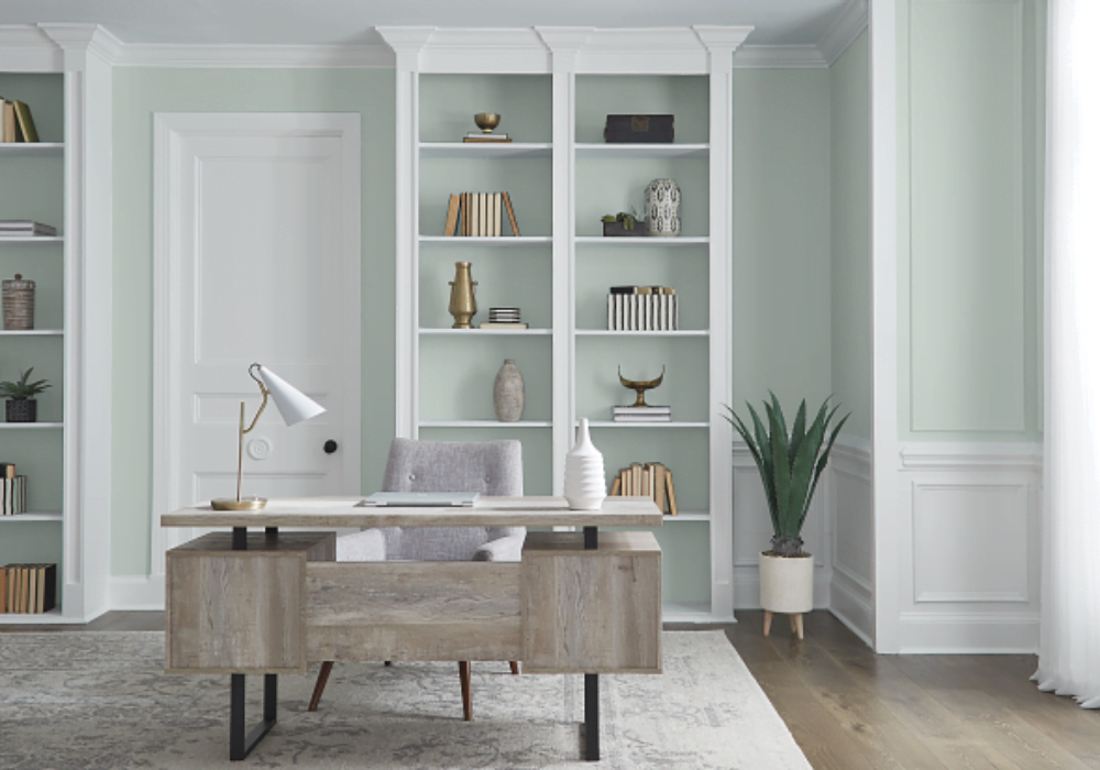
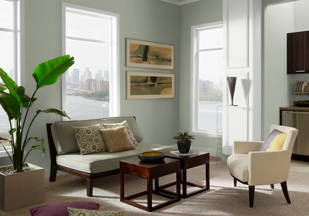
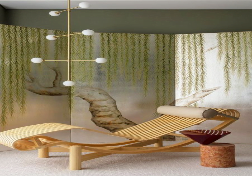
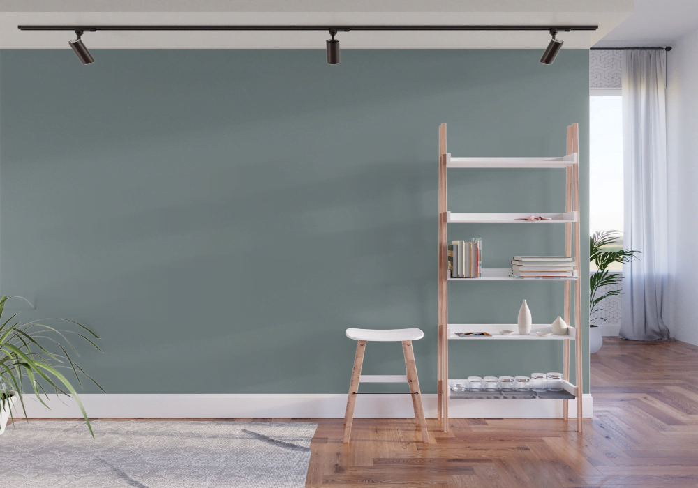
With neutral and pastel shades coming into the spotlight, everyone’s eager to transform their homes by trying these minimalistic shades. The most trending color going on right now is the gray-green paint color, as this mixture is easy on the eyes, contemporary, and very soothing.
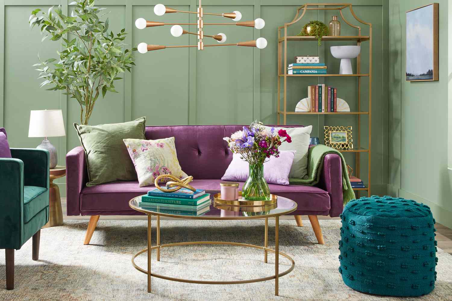
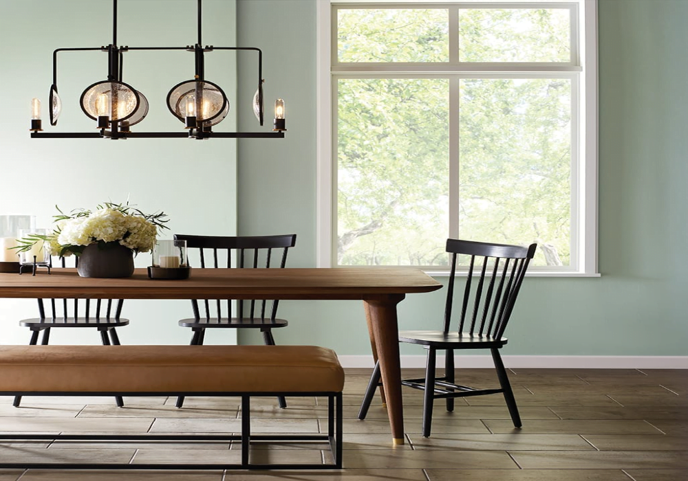
Using a shade of green directly associates with the beauty of nature. When you bring this shade home, be it in your dining or bedroom, it livens up the place. The best part about painting your house with gray-green shades is that you can add any other colors, which would look fascinating.
If you are looking for a refreshed change of scenery, check out these 20 combinations of gray-green colors. Choose your favorite shade, pick up the brush, and start painting.
List of 20 Best Combinations of Gray-Green Paint Colors
There are so many green-gray shades to choose from, so here’s a list of the most picked paint colors by the customers.
1. Behr Shy Green
It is a muted green-gray paint with warm undertones and is an ideal choice for all rooms. It relies more on the paler side of the color chart. Shy Green, when applied to the walls, feels lighter as it blends naturally with the ambiance of your house. Being a neutral shade allows you to decorate the space according to your taste.
2. Benjamin Moore Dakota Shadow
This Benjamin Moore Dakota Shadow resembles the color of the moss plant and even the olive green shade. It is a perfect shade that can act as both a base coat and a final coat for the accented look. You can even pair it with other pastel shades. The mossy paint looks terrific when decorated with chrome chairs and elegant ornaments.
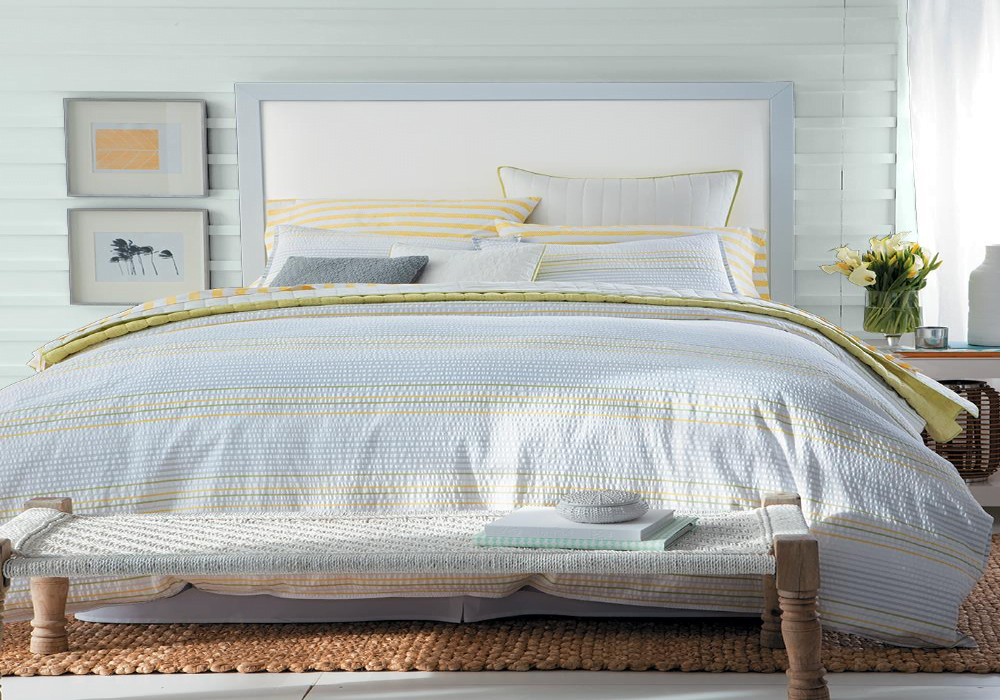
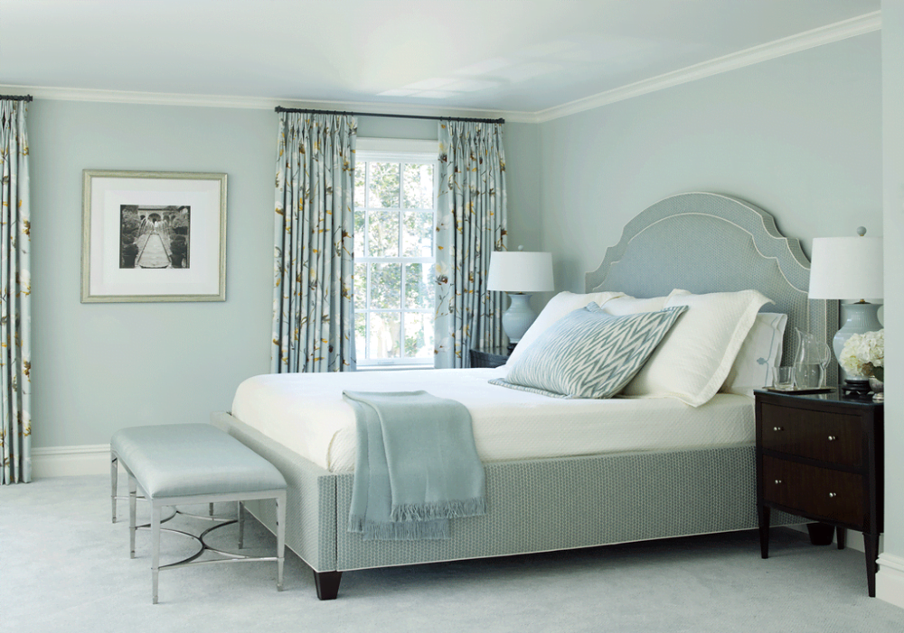
3. Sherwin-Williams Frosted Fern
Sherwin Williams Frosted Ferm is a creamy, off-white tone of gray-green paint color. It’s more on the grayer side than green, with a warm, natural greenish undertone. This color is preferred more in bedrooms because of its serene glow. Pair it with other muted shades with a similar tint and texture.
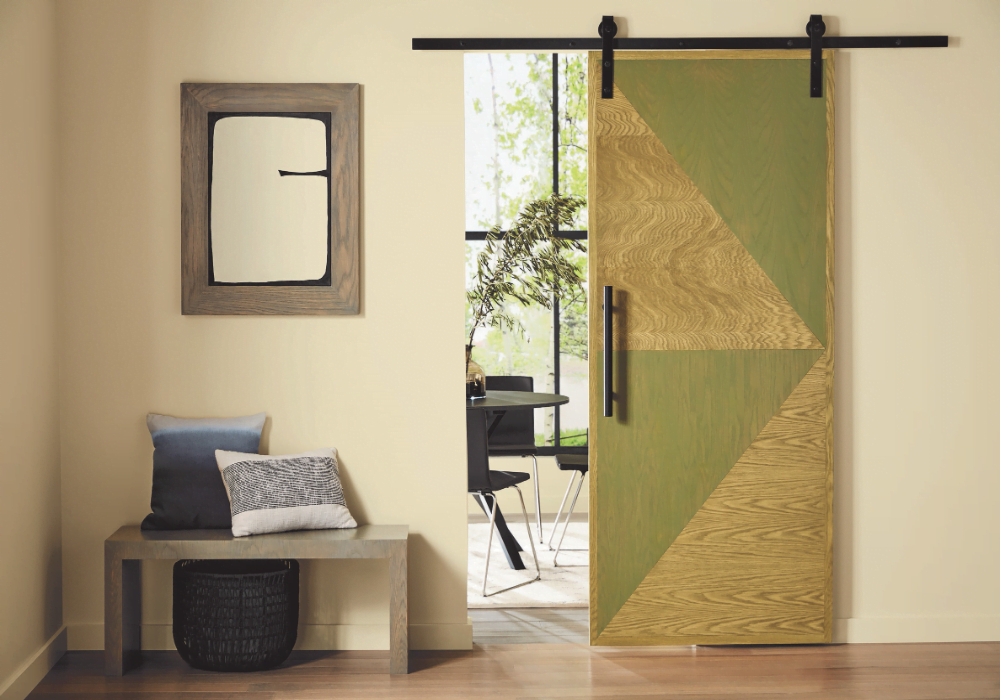
4. Farrow & Ball Calke Green
Calke Green is such a rick-looking shade that can transform your house completely. The shade is inspired by the original color found in Calke Abbey’s breakfast room. You can simply use it as a whole or comb it with a darker pastel shade for an elevated look. It looks best in smaller or study rooms because of its darker tint.
5. The Spruce Best Home Matcha
Spruce Best Home Matcha hue is an elegant choice to make your room appear warm and welcoming. If your room has windows, it will elevate the shade even more. What’s impressive about this shade is with an increased sheen level, it changes its reflection according to the sun’s exposure. Who doesn’t want a shiny room in their house?
6. Benjamin Moore Revere Pewter
Revere Pewter might seem all gray, but it is one of the most subtle colors with a greenish undertone. This Benjamin Moore shade is versatile and changes its tone under the warmth of natural sunlight. When applied, it gives off a sophisticated look. So, if you desire your residence to become the talk of the town, Revere Pewter is your color.
7. Farrow & Ball Teresa’s Muted Mint
This Teresa’s Green is an aqua shade because of its rich blue base and soft green undertones. Applying the coat of muted mint provides a calming and therapeutic effect, but when mixed with gray or neutral shades becomes chirpier. As it is a lighter color, you can go for dark furniture and decor items to complete the look.
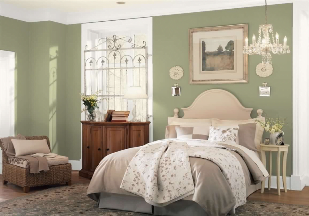
8. Better Homes & Gardens Laurel Leaf
Laurel Leaf is currently the prime color of Better Homes & Gardens. With its summery undertone, it blends flawlessly with beige and white tones. The shade is an ideal choice for your dining area or bedroom as it provides a soothing touch. So, bring out the houseplants, furnish the place, add on some accessories, and voila, your room is ready.
9. Benjamin Moore Budding Green
Most of the gray-green paint colors have a greenish undertone. But Benjamin Moore’s Budding Green is a soft shade with a light green hue and grayish touch. The grey tone peeks out when placed under the proper lighting, balancing the overall texture. Painting with a Budding green shade feels like having a misty spring right in your room.
10. Glidden Morning Fog
Glidden is another light pastel tint of gray-green paint colors that looks appealing. It’s dominated more by the gray shade, but the greenish touch makes it almost appear white. However, it doesn’t come out as a flat white but more of a pleasant, easy-on-the-eyes white. So, if you’d prefer to paint your house white but not entirely white, Morning Fog is a perfect choice.
11. Sherwin-Williams Silverpointe
Out of all the Sherwin-Williams collections, Silverpointe is the most natural color. It uses the shades of blue and green undertones to bring out the gray, greenish tint. At first glimpse, it appears as a cool gray shade, but it emits a form of smoothness that flows freely on your walls.
12. Krylon Rolling Surf
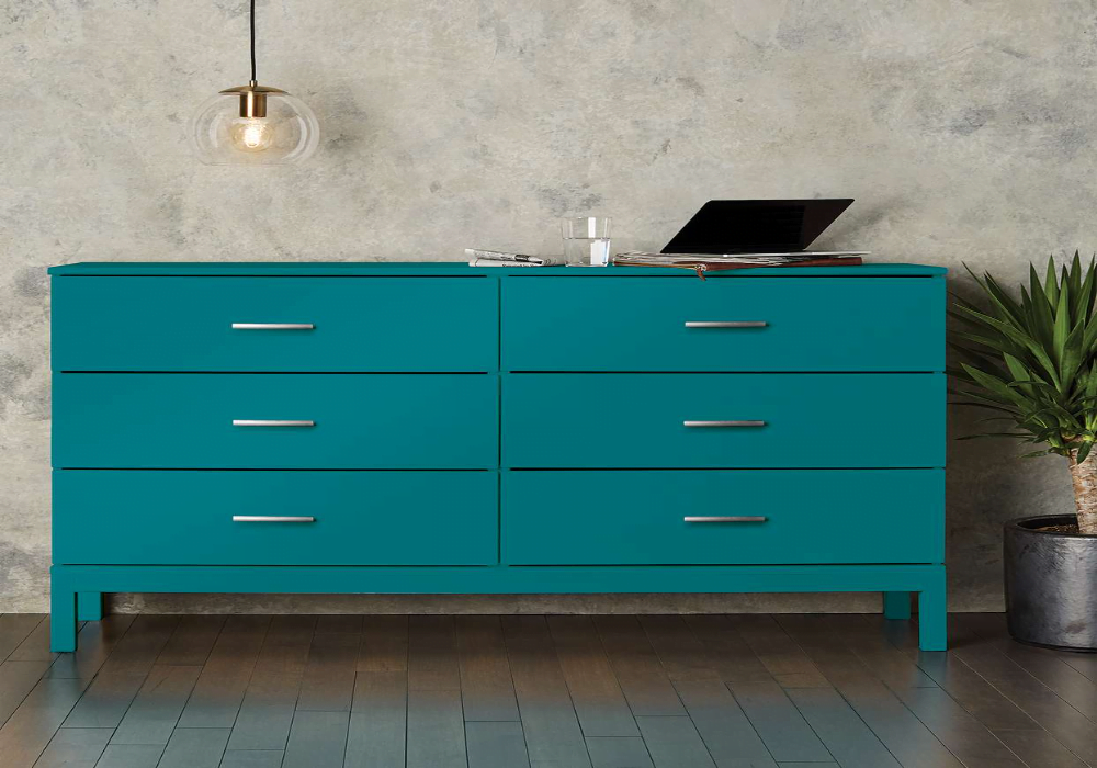
Krylon Rolling Surf is all-in-one spray paint. It comes in various colors, but this deep blue-greenish teal shade is the closed one on the gray-green color chart. It’s very easy to spray, has best-in-class adhesion qualities, and is durable and rust-protectant. This bold tint quickly dries off, giving your wall a fresh look.
13. Minwax Gentle Olive
It is a water-based stain that is used to paint over wooden boards. Minwax Wood Finish Solid Color Stain has a strong opacity that brings out more color than wood grains, keeping its texture intact. This Gentle Olive shade is ideal for smaller spaces, furniture, or cabinets, providing a trendy solid greenish touch.
14. Benjamin Moore Webster Green
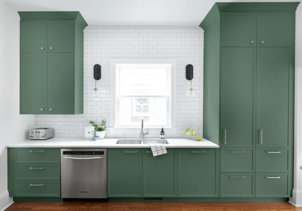
Another chic color from Benjamin Moore’s collection is the Webster Green shade. The tint looks great when painted on kitchen cabinets or in the restroom. It is one of the darker tones that fits best in distinctive settings. It gives a crisp, clean finish and holds an LRV value of 20.2 points.
15. Pratt & Lambert Kelly Green
When it comes to hallways and stairwells, going with paler shades might give a bland look to your house. Instead, go bold with Praat & Lamber’s Kelly Green color to brighten the narrow space. The saturated green tint brings out a certain vibrancy to the entire place but also allows the decorative items to stand out.
16. Donald Kaufman Camo Green
Camo Green is a summer garden color heavier on the light green shade with a gray undertone. It appears as an English vintage color that can be combined with darker and neutral shades providing a cheerful ambiance. Donald Kaufman’s gray-green paint color can be used to paint your children’s rooms to bring out playful vibes.
17. Sherwin-Williams Oyster Bay
Oyster Bay is a cool gray shade with blue and gray undertones. It offers a level of neutrality that functions quite well with its surroundings. With an LRV level of 44 points, this Sherwin-Williams tone looks comforting when applied painted in your bedroom or bathroom. This algae shade also has a crisp, refreshing finish to it.
18. Farrow & Ball Green Smoke
When in the mood for something striking, go for Farrow & Ball’s darker gray-green paint color. Green Smoke shade proves that dark colors are not dull or dingy. Instead, they provide a pleasing and inviting look that gives you room for lighter personal touches. So, go, be bold with your paint color choices.
19. Glidden Scarborough
Glidden Scarborough is a gray-green paint shade that comes with a solid, flat green base and a light gray overtone. This mid-tone gray tint is a complex yet charming color, bringing composure to the place. You can either use it to paint your bedroom walls or look great on the kitchen cabinets.
20. Benjamin Moore Healing Aloe
Healing Aloe may look more like a blue shade, but it’s surely not. When exposed to sunlight, the color shows its strong green and gray undertones, making it appear as a blue tint. As the name suggests, this Benjamin Moore Healing Aloe is soft and flowy, adding a sense of serenity to the space.
How to Choose a Gray Green Paint Color?
It’s obvious that you can pick out gray-green shades according to your choice. However, there’s an essential criterion: the tone of your house. Gray Green Paint shades offer a range of soft neutrals to darker hues. So, choose the ideal color palette that you’d prefer to paint on your walls.
1. Neutral Tones
These green-gray shades are usually considered neutral hues. However, there could be differences going when choosing between these tones as flat bases or shiny overcoats. Neutral shades are mostly muted, so gray being neutral and green being vibrant, the combo snuck out as a natural shade. These tints are earthy, easy on the eyes, and elegant-looking colors for your space.
2. Cool Tones
Having a clean and crisp finish can be done only by the cooler tones. These cool shades bring a sense of freshness to the place. With green being a primary cool tone, there are so many shades of green-gray hues you can choose from. Cool color’s purpose is to offer a soothing vibe, and painting bedrooms with these shades would work the best. People seeking refreshment outside can paint their rooms with these shades and stay relaxed all day long.
3. Warm Tones
Warm tones of gray-green paint colors are supposed to be energetic and playful. If seen separately, green and gray don’t fall in this category. However, when combined together, they make a perfect warm tone to try in your home space. Warmer tones provide a sense of homeliness and comfort, and these shades do precisely that. Paint your living or dining area with these tones to make your space appear more welcoming and pleasant.
Summing It Up
All in all, green is a very versatile color, but when blended with gray, it could turn out either a warm, cozier vibe or a vibrant, bold feel. There are limitless combinations that one can form from gray-green paint colors. And in the article, we have covered the most commonly used and trendiest tints of gray-green shades.
So, if you plan to change the outlook of your office or your home space, the combo could play a significant role in doing so. What’s best is that these shades can also be used as undertones or overtones with many distinctive colors.
So, what are you waiting for? Go out, get the colors, and paint away your troubles. Don’t forget to tell us which shade you’d prefer to use in your home.
Frequently Asked Questions
What Color Furniture Goes Well with Gray-Green Paints?
Gray and Green combined together forms a refreshing look and can be complemented by a range of colored furniture. Adding a pop of neon chairs or a white dining set will give a modern look. While pairing brown or wooden furniture will provide a homely, warm look.
What is LRV?
LRV, Light Reflective value, is a factor (from 0-100) used by design professionals to present what percentage of the light a surface reflects. LRV 0 means pitch black, whereas LRV 100 means pure white. An LRV value will offer a darker shade, whereas a higher LRV will be more light and airy.
Why Choose a Gray-Green Paint Color?
Gray-green paint colors can easily blend with other darker and lighter shades like reds, whites, or pinks. Also, it works with every style, whether traditional or modern. At last, the shade not only looks good on the walls but works on kitchen cabinets, doors, wainscoting, and more.
Which Colors Blend Well with Gray-Green Paints?
There are so many neutral and darker colors that go well with gray-green paint shades. Starting with Red, Pink, White, Beige, Yellow, Brown, Orange, Blue, and even Neon tints. All you need is to decide what theme you want and select the color palette accordingly.